Feature Wall Art Ideas

It can be a challenge to find the right artwork for your feature wall that is the right size, scale, and price tag for your budget. Hopefully some of the photos here from projects past and present will inspire you!  I will start with the oldest ideas and work my way to the present. 

This was the feature wall in the Family Room of our first Townhouse as newlyweds here in Calgary 10 years ago. (Awww!!) I knew I wanted something with impact, but money was definitely an issue. Let me start by saying I have literally NO artistic skills when it comes to painting or drawing. Zero. Zip. Zilch. So don't let my use of a few simple tools here fool you- anyone can do this project.

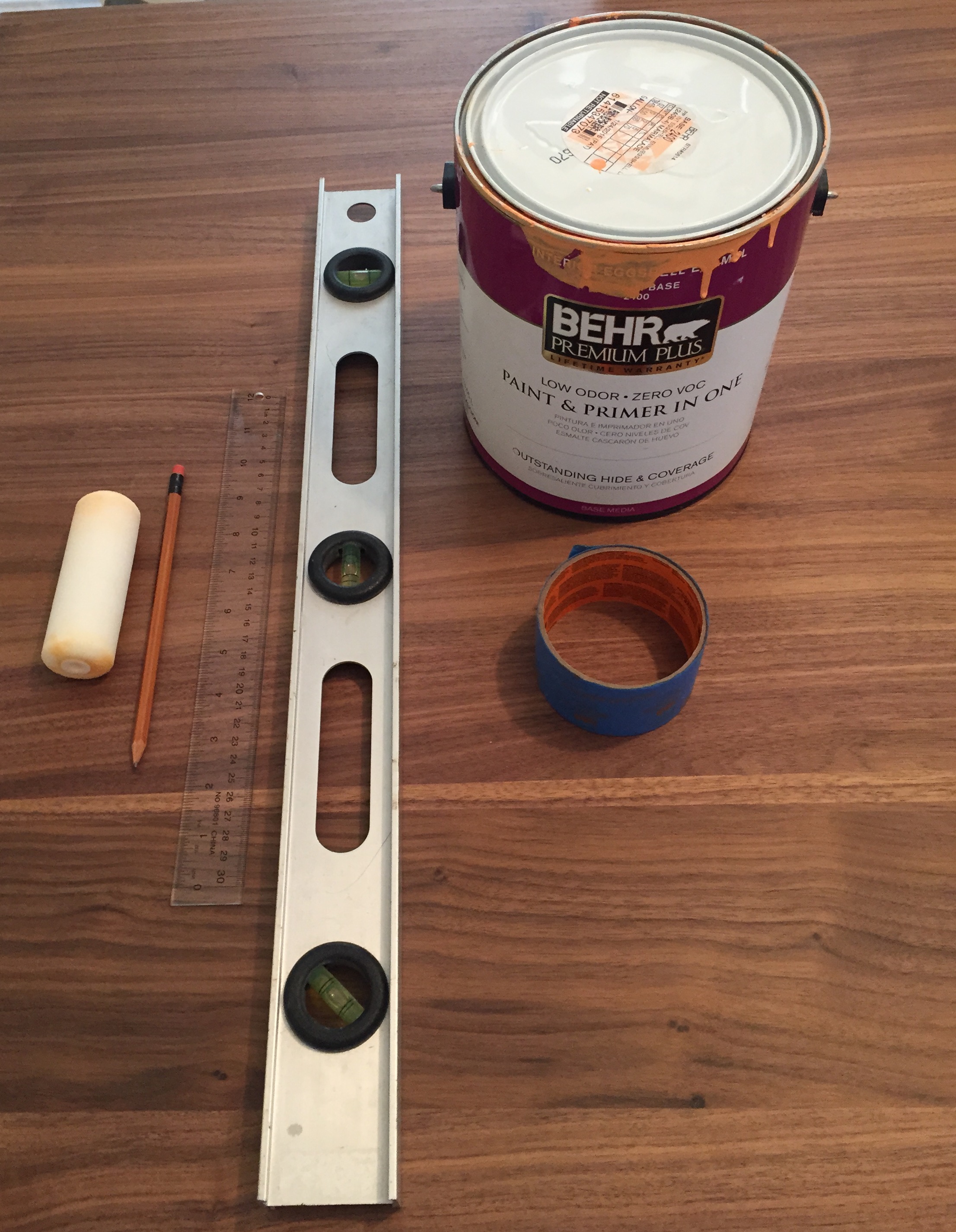
 I adapted this from something I saw on a design show. I used a 3' level, painters tape, a ruler, a pencil and of course, paint. Each color is painted in layers, 1 day at a time. But I was really pleased with the overall effect, and may still use this again some day! 

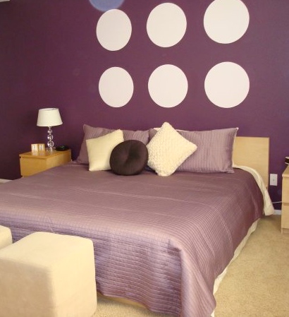
A few years later, we moved to the greater Palm Springs area in California. We had a pretty large master bedroom, and nothing I found shopping around town seemed to be big (and light enough for living in an earthquake area) enough for what I needed. So, again I used paint. First I painted the wall the dark eggplant color. Then I measured (ok, my husband may have helped with this step. Math is not my friend) to determine where the center of each circle would be. I used a platter from my kitchen to trace out the circles, and carefully painted the inside of each circle lavender. 

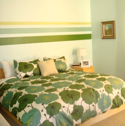
Well, I quickly grew tired of the dark color palette and within a year or two I found myself again painting our enormous bedroom. This time I went for stripes. Less math.  I pulled the colors directly from the duvet cover I purchased online from West Elm

This was the office in this same house in the desert (well, one of three looks we tried). The longest wall in the room without a window was above our desks. It never looks right to put pictures above computer monitors, but I thought these fun little foam shapes added some interest. I purchased them at Crate and Barrel for about $10 and had no idea how I would use them. As coasters, maybe? I used double-sided sticky foam tape to adhere them to the wall. And since the wave pattern is a bit asymmetrical, it took no measuring to get the pattern right. 

And here we are in our current 1950's bungalow back in Calgary. While living in California, we had ordered some Vintage Disneyland Ride Posters from a store on Main Street in Disneyland. They were around $50 each, and I cut them down myself to fit inside IKEA picture frames. 

Recognize these little foam shapes? Yep, they are the same ones that were in our office in our old house. But I used them differently here in our "Master Bedroom" which is roughly the size of a postage stamp. But that's another blog post. The stems of the dandelions are painted on with some extra grey paint from our bathroom. So this feature wall project technically cost me nothing. I love a bargain!

These little crazy things are my favorite. I purchased them (there are 2 side by side) from CB2.com for about $70 each a couple of years ago. I used them on opposite walls in our last place, but I really like how they look together. This is another long wall in our Family Room as you enter the house. Normally, I suggest keeping your art just a bit narrower than whatever it is being hung above. But there are exceptions to this rule. Sometimes it's nice to use something a bit more sculptural, as appose to always hanging pictures. Don't you agree?

I purchased this fun piece of art on sale for about $60 at one of my favorite shops, Urban Barn. They have fantastic sales- this piece originally went for about $120 or more, I can't recall exactly. I already had the duvet purchased on sale for $40 from EQ3 for our guest room, so I knew I needed something that worked with orange. The rest of the color scheme was planned around this piece of art. The scale is perfect for the room, especially since it's the only piece of art. 

Tips: 

Have fun with your artwork! Life can be pretty serious, so if there is one place to have fun with your style it's in your own home- and especially with your artwork. I love a piece of art with a sense of humor. 

Pay attention to the size, color, texture and quantity of art in a room. Don't be afraid to try something  big, sometimes a single piece of large art is all a room needs. 

Make sure you balance the color in the artwork throughout the room. If you put up a painting with red in it, for example, but the rest of your room is all neutrals, you will need to balance the color by adding a throw pillow or candles (or both) in one of the colors from the painting to tie it all together.

As a general rule, the center of the art should be at about eye level. But that will be impacted by your ceiling height. When in doubt, hang it a little low. 

Center your art above the furniture, not centered to the room. Unless, the furniture happens to be centered, too (but it doesn't need to be). 


Questions or comments? Let me know what you think!


Ocean Themed Baby Shower Invitation

This weekend I had the privilege of hosting a baby shower celebrating the arrival of my dear friends sweet new baby girl. It takes lots of planning to successfully host a party, and for me it all started with the invitation.

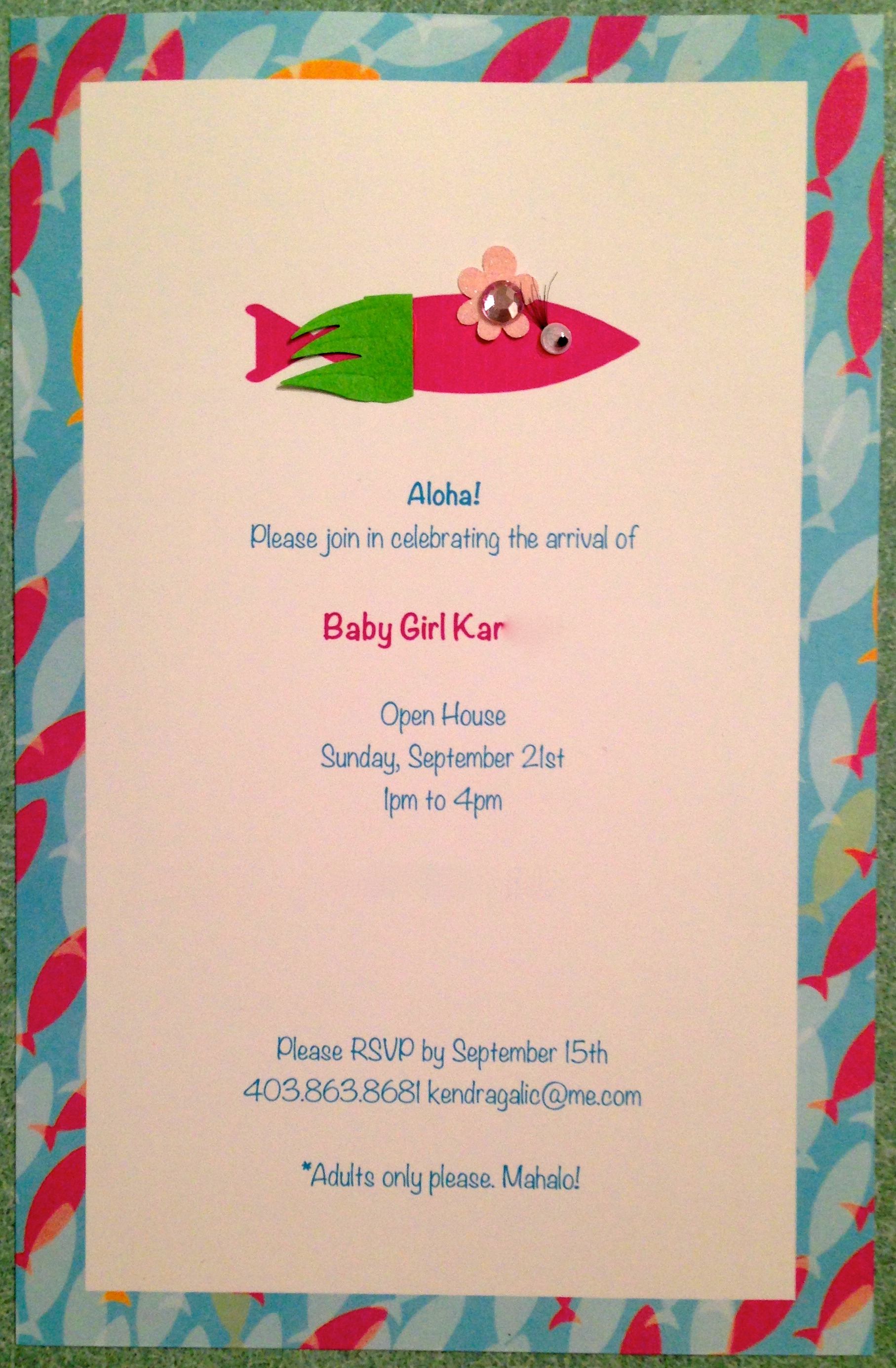
I started with a blank piece of high quality card stock and wondered around Michael's looking for a piece of craft paper that spoke to me and the ocean theme I was planning. Found a fishy one I liked and scanned it onto my computer. Next, I added some clip art, and then got some help from my husband using Pixelmator and Swift Publisher 3 apps on his Mac to use the scanned image to create a border, and then change the color so that one of the background fish was pink. A few finishing touches (including false eyelashes from my makeup bag) and voila! A simple, but totally unique Baby Shower Invitation. 

Home-made Baby Shower Invitations

Home-made Baby Shower Invitations